Help Center
Product Page Layout
In the WordPress Customizer go to Product → Product Layout
Page Layout
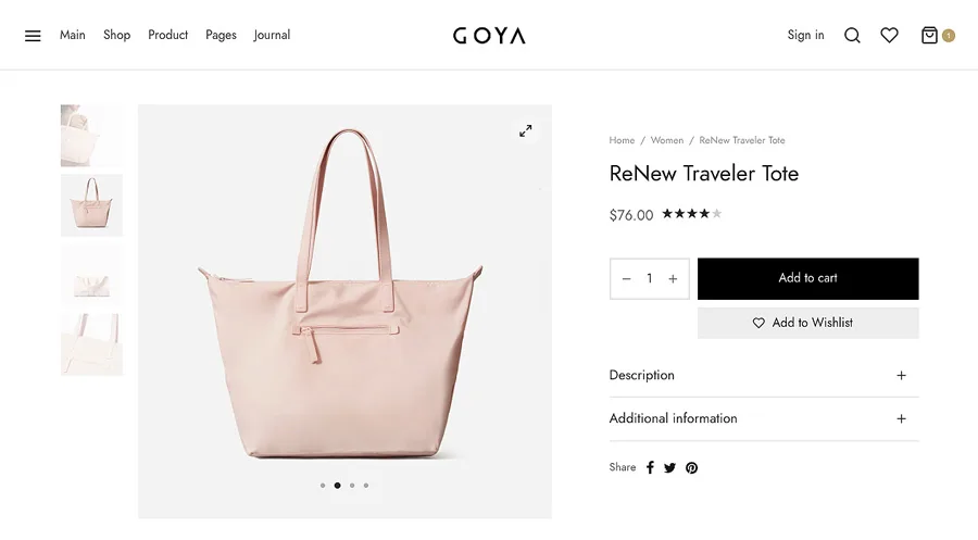
Regular

The classic layout with the gallery to the left and details to the right.
Showcase

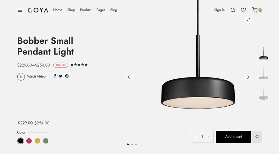
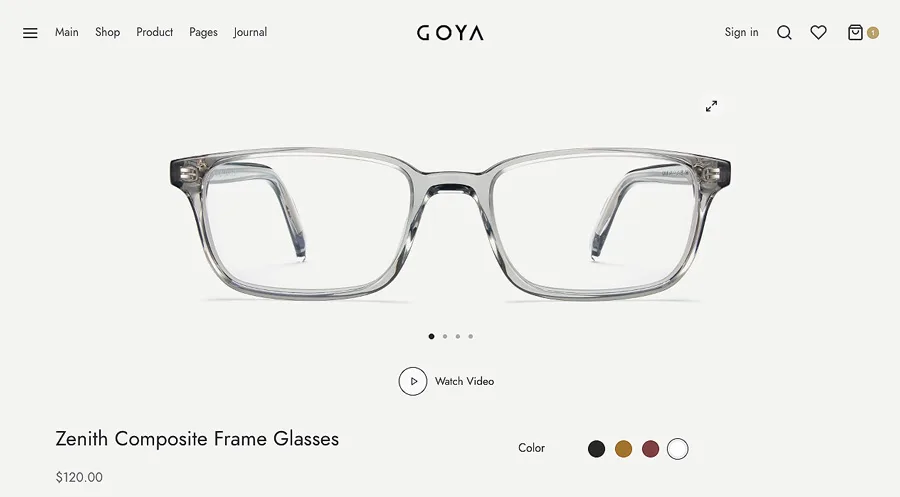
This layout has the following features:
- Product title is enlarged and moved to the left.
- The image gallery is mover to the right with no extra padding.
- Header is always transparent on this style.
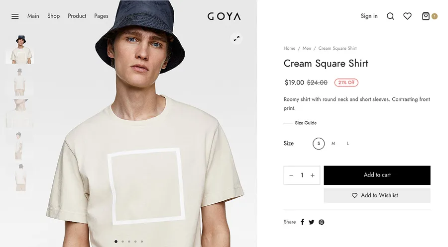
No Padding

On this layout the image area is expanded to the edges. Use large image for best results.
Full Width

With this style the product gallery and details are stacked at all screen sizes. Best results are achieved if your images are horizontal.
Details Mode
There are 3 options for the product details
Tabs
This is the default WooCommerce style.

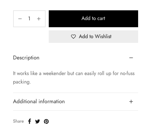
Accordion
Suitable if your product description is short. The reviews will appear at the bottom.
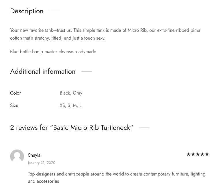
Vertical
A single column to view all information without any other clicks.
Override style on specific product
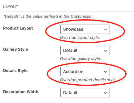
You can override the default layout style on each product. On the product edit page go to Layout Settings and select your preferred Product Layout and Details Style
Extended Description
This is not an independent layout. It’s just the regular product description field but with WP Bakery enabled.
To use WP Bakery on products, go to menu WPBakery Page Builder > Role Manager and make sure Product type is checked.

By default the content area is narrow. When you edit a product scroll down until the Page Settings and you can make the layout full width.
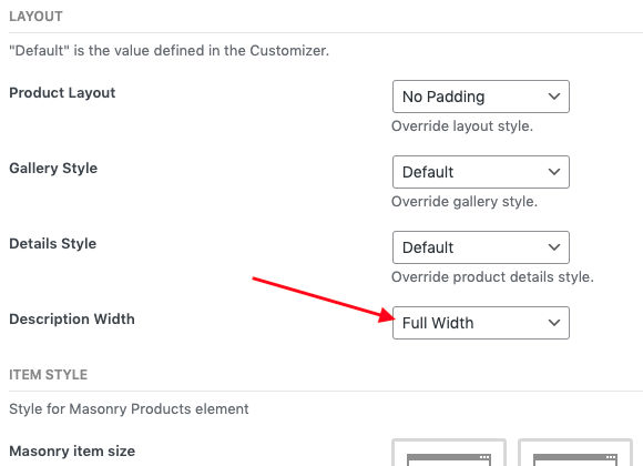
That’s all you need. Everything else depends on your own content.
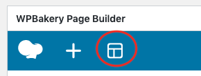
Now, you can insert the ready to use WP Bakery templates on the product description.
Sticky Product Bar
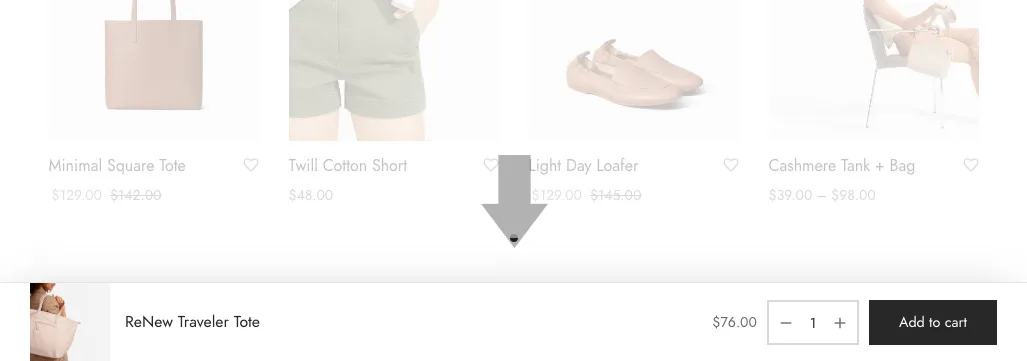
A sticky bar with the basic details which allows your customer to scroll the page and add the product to cart at any time.
It’s possible to stick the bar to the top
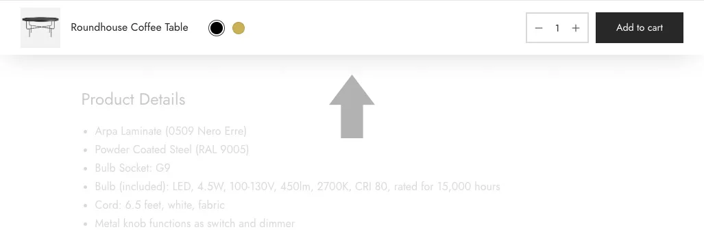
or bottom
